
STEP BY STEP: Behind my brand and website refresh
Step by Step is the blog of Kate Kerin Interiors. In addition to following some of my clients’ projects, I examine some of the latest issues of interest in the world of interior design.
This month I have something a little different to share. Side by side with working on other people’s homes, I have also spent recent months reworking my own brand and website from the ground up. It has been one of the most rewarding projects I have undertaken, and also one of the most revealing, because for once it asked me to sit on the other side of the table.
My aim was straightforward, even if the work behind it was not. I wanted my brand and website to reflect the experience I want every client to have, one defined by elegance and calm rather than stress and chaos. I wanted it to convey steady, reassuring leadership while still honouring each client’s own style and preferences, because my role is never to impose a signature look. In short, I wanted a grown-up website for a grown-up business.
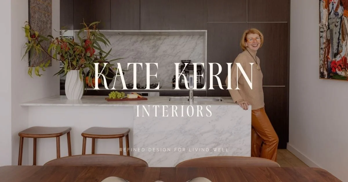
New home page, www.kkinteriors.com.au
Taking my own advice
Working with my brand designer, Kylie Biré from Indeko Creative, was a genuine revelation. She began by leading me through a moodboarding process for my own business, which was a slightly humbling moment. It is exactly what I do with clients at the start of every project, and yet I had never taken the time to do it for my own company. Turning that familiar process on myself was clarifying, and more than a little overdue.
From there we worked through the same questions I put to my own clients. Who is this really for? How should it feel? What should someone sense the moment they arrive? Having those conversations from the client’s chair gave me a renewed appreciation for how much thinking sits beneath a good result, long before anything is chosen or designed.
The psychology of colour
The part closest to my heart, unsurprisingly, was the palette. Rather than locking myself into a single set of colours, Kylie and I built a flexible palette that spans cool tones, warm tones and neutrals, so that I am never boxed in. These are precisely the ranges my clients need in their own homes, and knowing when to reach for each one is half the skill.
What I found fascinating was the psychology behind the choices. Soft blues and warm, mineral-based hues combine to create a palette that feels layered and atmospheric. Olive green references longevity, growth and a connection to nature, which grounds everything in a sense of stability. Russet brings warmth and depth, while taupe and linen introduce a softened, neutral anchor that lets the other colours breathe. None of it was accidental, and every colour was chosen with the same care and intention I believe a home deserves.
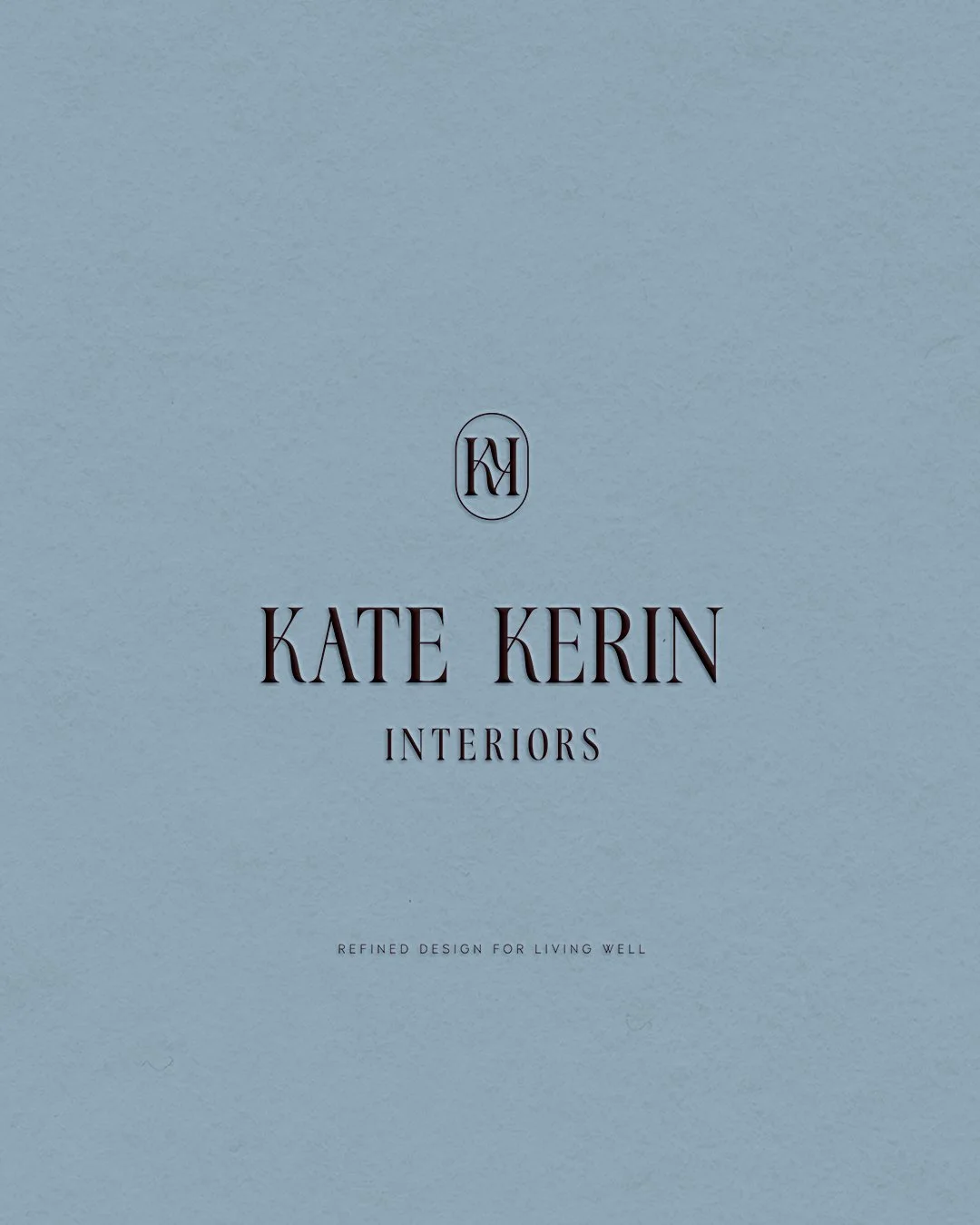
My beautiful embossed brand mark, featuring two of my signature colours, chocolate and duck egg blue
A brandmark and a story that are truly mine
After a great deal of discussion about what makes my practice individual, Kylie designed a brandmark built around two intertwined Ks, which I love. She then custom designed a typeface to match my vision, refining it patiently until we were both completely happy. There is something quite moving about seeing your own name and story rendered with that much thought, and knowing that no other business shares the same mark.
Alongside the visual identity, we spent considerable time on the words. We discussed my mission, my values and the clients I am here to serve, and Kylie drew all of it together into a written brand strategy. She managed to take the ideas I had been carrying around in my head for years and set them down clearly on the page, from my brand story and messaging through to my tone of voice. Every word of the website was then pored over, debated and refined more times than I care to admit, until it said exactly what I meant.
My primary logo, in olive green
Was it worth it?
I will be honest, it was a meaningful investment for a young business, and not a decision I made lightly. Even so, I would do it again without hesitation. I have come to see it as an investment not only in my company and in my goals, but in the experience of every client I work with from here. When my own foundations are clear and considered, I can offer that same clarity to the people who trust me with their homes.
That, really, is the thread running through all of this. Whether it is a brand, a website or a family home, the principle holds. Get the thinking right at the beginning and the rest follows with far less friction. It is the lesson I relearn on almost every project, and refreshing my own brand has only reinforced it.
All of which brings me back, as it always does, to the projects that keep this work grounded in real homes and real people.
Brand stamp, in russet
Project update: North Shore downsizers
My North Shore downsizer project is full steam ahead, and it has been an absolute pleasure from the outset. The walls have come down and gone up again, and for the first time we can stand in the space and see the new layout, which matches the original vision perfectly. The floors have been levelled and the new floorboards go down this week.
The joinery design is now finished, and the joiner has sent the final drawings through to the manufacturer, which is always a satisfying milestone. From here we move on to the stone, the painting and the lighting installation, and then into the final decorative stages. It is coming together beautifully, and has been the kind of project every designer hopes for. I’m grateful to be working with the professionals at @smith.and.sons.hornsby, @buildcrest_projects, @braverelectrical, @cosmostyle_design, @urbanlighting, @nickssuperpainting, @sydney_stone_creations and many more.
Project update: West Pymble
My West Pymble project is also progressing well, although I suspect the clients might describe it a little differently this week. They moved out last weekend and into a rental so that the builders can begin pulling apart the lower level of the home. It is a big upheaval for a busy family with two young children, and there is no pretending that this stage is anything other than disruptive.
Behind the scenes we have been steadily working through selections, including carpet, kitchen cabinet handles, colours, lighting and tapware. There is a great deal happening all at once, and yet they are making considered, confident decisions throughout. They are right in the thick of the chaos at the moment, but it will all come together for them, and sooner than it probably feels right now. Shout out to another terrific building team, @allmintdesigns.
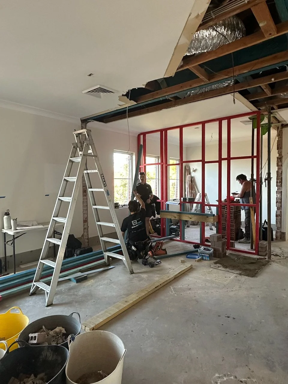
North Shore demo and rebuilding in progress
Final Thoughts
I am thrilled with how the website refresh has turned out, and I would love for you to see it. Do visit the site when you have a spare moment and tell me honestly what you think, because every piece of it was made with the same care I bring to a client’s home. But I’m always open to feedback, and your opinion matters.
And if all this talk of colour has you thinking about your own place, this month’s free resource might be just the thing. It is called Yes You Can: Build a Palette You’ll Love for Years, and it walks you through choosing a palette for your home with confidence rather than guesswork. Whether you are planning a renovation, a downsizing move or simply a refresh of your own, you can find it, and book an initial consultation, at kkinteriors.com.au.
Kate Kerin Interiors works with discerning Sydney clients who value quality, elegance and a seamless design experience, whether you’re downsizing, furnishing a new home or planning a major change. If you’d like to discuss your project, get in touch to book an initial consultation.
If you enjoyed this blog, subscribe to my newsletter for curated interior design insights, inspiration and practical tips delivered straight to your inbox.